
You finally sit down to color—and spend the next ten minutes deciding which green to use.
Sound familiar? A fresh coloring page can be full of possibilities, but sometimes all those choices make it harder to begin. What if the colors clash? What if you pick the wrong shade halfway through?
The good news: you don’t need a perfect plan. A few colors you enjoy are enough to get started.
Start with just three colors
You don’t have to use every pencil in the box. Pick three colors and repeat them throughout your design. This gives you fewer decisions to make and helps different parts of the page feel connected.
Try a main color for larger areas, a second color for supporting details, and a third for little pops of interest. You can always add more as you go.
With colored pencils, try using light pressure and then layering the same color to create deeper shades. One pencil can give you more variety than you might expect.
Borrow a palette from something you love
You probably notice beautiful color combinations every day without thinking about them. A bouquet on the kitchen counter. A patterned scarf. The mountains just before sunset.
Look at a favorite photograph or something nearby and choose three or four colors from it. You don’t need an exact match—let it give you a starting point.
A mountain scene might inspire dusty blue, pine green, and warm brown. A bunch of summer flowers might suggest pink, yellow, and leafy green.
Choose the feeling you want
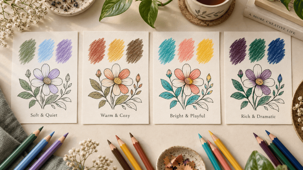
Would you like your page to feel soft and quiet, bright and playful, or a little mysterious? Use that as your guide.
Here are a few combinations to try:
- Soft and quiet: sage green, pale blue, and lavender.
- Warm and cozy: terracotta, golden yellow, and chocolate brown.
- Bright and playful: turquoise, coral, and sunny yellow.
- Rich and dramatic: plum, emerald, and deep blue.
These are starting points. If one shade doesn’t appeal to you, swap it for something that does.
Give your colors a quick test
Keep a piece of scrap paper nearby and make a small swatch of each color before you begin. Pencil barrels and marker caps don’t always show exactly how the color will look on paper.
Seeing your choices side by side can help you decide whether you want a lighter shade, a warmer tone, or a little more contrast. A quick test can save you a lot of second-guessing.
Let a tree be purple
A coloring page is a lovely place to experiment. Leaves can be turquoise. Flowers can be blue. A familiar building can take on an entirely unexpected personality.
You can also leave some areas white. There’s no requirement to fill every space or finish the whole page in one sitting.
At Unwind and Flow, we love seeing how the same design becomes something different in every person’s hands. Your color choices are part of what makes it yours.
Pick three colors, open your favorite Unwind and Flow coloring book, and start with one small section. You can decide what comes next when you get there.
 Unwind and Flow Coloring Books
Leave a comment